Description:
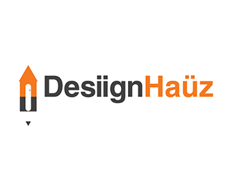
Whith this concept I wanted to show the different kind of services Desiign Hauz has, product design, business strategy branding and not just the architecture and interior design. I think is important to communicate that the company is a House of Design and not that you just design houses and interior. That why i took the tool all designer have in common: the pencil, and mix it up simple and clean in a small house with a top rounded open door.
The typography is Helvetica, a classic for design. I love that typeface and it is very iconic itself. I wanted to use non saturated colours to ad seriousness and the red tone is for the passion of design.
Status:
Unused proposal
Viewed:
2259
Tags:
•
geometric
•
simple
•
flat
Share:



Lets Discuss
Please login/signup to make a comment, registration is easy