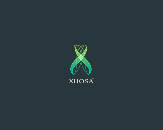
Description:
logo for insurance agency, the sign make letter X, it had to be simple and instil reliance
As seen on:
presentation
Status:
Unused proposal
Viewed:
31589
Share:

Lets Discuss
Fresh colors, mark is very sweet.
Reply%5E Same here, very nice.
Replythis is at least interesting!
Replyyess very well..
Replynice colors... refreshing.
Reply@milou, @zibbidy , @Lecart , @sbj, @lumo : thank you fellas, its worth much for me **@anthony: thank you for your honest opinion, I see your point, maybe you are right that many others insurence agencies has their own style but it was company decision to make the sign with fresh colors and modern style, so I tried to join it. And i see in this sign a little elegance ... hope not only me**Anyway thank you and i promise if they didn't like it I would collect it for video game. *
ReplyI think %22reliance%22 as you mention here is something that, emotionally, is associated with solid ground. Standing on a firm surface. Substance. **What this logo, if you are as you mention conveying %22reliance%22 then transparency contradicts that. **Also, AnthonyLane makes similarly valid points. Look at the biggest names in the industry, see what you get. Good luck with it.
Replyorganic...
Replythe logo is hot... what do they insure?**I am all for modern and cutting edge...insurance company logos currently suck..I just call and get the best quote..I feel no emotions by looking at their logos haha
ReplyAll funniness aside, I get the same feeling as Anthony does. Doesn't quite seem right for an insurance company. I too am all for modern and cutting edge, but there's an appropriate way to do it given the field you are designing for. The design is interesting though.
Reply@raja thanks:) comercial and life insurance mainly.
ReplyI completely agree with Tony and Kevin, this is not fitting at all for an insurance company.
ReplyThat's not to say the design isn't nice, just not appropriate IMO.
Replythank you guys, i take into account your opinions, you are more experienced so i trust you. i do research and try to come up with another idea**but anyway I am so delighted that you like the sign.
ReplyCool mark and Kudos for the different direction but before you cast it aside consider changing the empasis between the mark and the type (which is potentially making it look more game industry orientated) and colours ... just my 2 cents ... but i think this could work. Many industries via their marks have changed trends via their look and who says this isnt the start of another one. Not great examples but AT%26T and British Telecom are examples or more pertinent is http://www.my-quotes.co.uk/my_quotes/churchilltravel.jpg and http://www.directline.com/....
Replythere is no love left in the Insurance sector, it's just an attention economy**really good examples kaimere, there shouldn't be so much stigma attached with industry pigeon-hole thinking**reason I asked what kind of insurance was because, if you had something like disability insurance, then this would look appropriate, fibre, tissue, etc..**this will definitely work on a DVD spine
Replyif anyone is not convinced that the insurance industry does not really adhere to %22what is accepted%22 check out **http://www.aflac.com/individuals/default.aspx**http://www.ing.com/group/index.jsp**http://www.theautochannel.com/news/2007/10/15/067199.1-lg.jpg %3C%3C the gecko!**MetLife had Snoopy**prince said %22completely agree with Tony and Kevin, this is not fitting at all for an insurance company. %22**Explain what is fitting considering the above. :)**
ReplyThere is a question thats i always wanted to ask. Is that a logo really must be designed exactlythe same as the business is? *What i learn during my school time, my lecturer told Logo is not a diagram or picture, that why it stand a nema call %22LOGO%22 ! if we sell sport product, do we need to illus the football, basketball....etc?? NO! Nike, adidas is a good example. If we sell camera, do we need to put a camera to the mark? No! Canon is a good example...*May i know what is the opinion regarding my question above?*Anyway, i love this logo. What i see is , the mark made of 2 love shape and it look like DNA as well.
ReplyGary hasn't really over analyzed but has given examples where stepping out of the box has helped create a point of differentiation and recognition which has helped shape these now super brands. Remember at one point the medical industry was signified in most logos with the Caduceus - as frank zapper said with deviation there can be no progression
ReplyGary hasn't really over analyzed but has given examples where stepping out of the box has helped create a point of differentiation and recognition which has helped shape these now super brands. Remember at one point the medical industry was signified in most logos with the Caduceus - as frank zapper said without deviation there can be no progression
ReplyI think what the question many of us are wondering about is...is this for a contest?
Reply@Tony not digging at you just thought Gary made a good point ... as for the competition aspect .... do we have to submit briefs on here as well ?**
Reply@AnthonyLane, haha (i don't think i over analyzed) but i really curious about the question that i asked in my previous comment. (as in i do really see a lot illustrated logo as a trend now) *Can i asked another question?*What do you guys think of a good logo?*Thanks!*
Reply%5EAnthonyLane, no worry :), no one fault. We are here to share our opinion in design. Btw, i love your work and website :)
Replywow thank you ... i would never predict that this mark will meet with such attention**To make it clear, it is not for competition, the group of people are about to set up a insurance company and i get this chance to try to make something, i'm not so experienced sincerely i just starting my way with logodesign , so I really appreciate your help and tips. **Hope another project will be most appriopriate and this will be collect for some fake company :)
Reply@gary, so delighted and thank you for visit :)
ReplyKaimere said, %22Many industries via their marks have changed trends via their look and who says this isnt the start of another one.%22 It's always okay to break out of the mold to set yourself apart from your competitors, but I'm still with Anthony on this one. This logo with its current execution, style and color pallette would be much more effective in the tech or game industry. The mark is still nice and it can still work, it just needs to be stylized or illustrated a little differently. No need to throw this one out of the mix, just needs a different execution, in my opinion.**@raja : The Aflac logo still has a level of sophistication to it even though it's a bit playful and humorous. I think the abundant use of white space helps. The ing logo has a very corporate appeal even though the imagery and colors are fierce. The type is much larger in proportion of the mark and the style is timeless. The gecko is not a part of the logo it's a part of the identity. The snoopy portion of MetLife is also not officially a part of the logo, it's more a part of the identity. And you're completely wrong, there's no way this would work on a DVD spine. LOL!!
Replythe design is very nice indeed, the implication and audience behavior could be different though. Maybe coz it looks like a DNA helix at some point. But if the Insurance company likes it then what can one do other than just suggesting :). Good work though and nice colors!
ReplyThough I agree with Anthony, I do think you could recycle this so it fits with %22insurance%22 trends.. I think less gradients, less teal colors, and a different font could really change the feeling of it.. maybe not, but def give it a shot..**I appreciate your willingness to accept criticism. That makes a good designer.
ReplyI think the word we are all dancing around is gestalt. This does not have the gestalt of an insurance company brand. Feels very beauty industry to me. Now, contrasting gestalt can be intentional, but unless someone has the bucks to really push and establish that brand in the market to change perceptions...perhaps not always a good thing.*Aflac is a good example. They've hammered us with that damn bird so we get it. Can this client afford to hammer their market? That's the crux of whether this design can work.
Replyhuh, I just saw a hand held single-hole punch. !http://singleholepunch.com/images/single-hole-punch-24.jpg!
ReplyI really like the graphic very fresh, but agree that my impressions were not saying insurance agency, but if it fills the brief great job!
Replylooks very nice..
ReplyWhat a nice surprise to see it in gallery this morning :)*Thank you for that thanks for floats and such discussion, it means a lot to me and i can learn something from it.**@lumavine hehe funny :)**
ReplyI think it suits with a insurance company in year 2145... As a lot of people said before of me, it is really cool mark, but doesnt suit for a insurance company. The website it is also too hightech. But, you can make some changes, like people said or save this mark for another project. And yeah, if they client like it, then, to hell all of us! :)
Replygreat workkk
ReplyAlways liked this!
ReplyAlen, luiz, david thanks mean a lot!**I was thinking about changes but because of that the client wanted sth fresh and taking under consideration your opinions which are different i decided to keep it as it is. **I will wait till 2145 (:
ReplyExcellent logo. I think it's interesting that so many are quick to say %22this is not appropriate for an insurance agency%22 without asking what type of insurance the agency sells. Maybe it has something to do with science, technology or research? **Even if that's not the case, to me, I get a feeling of a clasp, something being held. It is abstract, yes, but the feeling is there for me. It makes me feel secure, looking at this mark and the soothing green colours. **Great work.
ReplyI asked that in an earlier post creativelifeform, to which patriciape said comercial and life ins..**Anyway, I agree with you, I still think this logo has the right feeling -- and strongly am against people's thoughts and their own preconceived notions of what an 'insurance logo' looks like.. **moot
ReplyAh right, sorry must have missed it!**But yep, I totally agree. *
Replywoah this spammers are pretty annoying... It's a nice logo btw
ReplyGreat color
ReplyVery nice little mark, voted!
ReplyAfter all that reading.... man .... nice logo I like not my favorite but did you know Xhosa is a language?
ReplyAll of your logos are wonderful. This one was so good that it made me Google to find out more about it (I found it on another page). I'd get you to design a logo for me any day! But I have to say, to me no, it doesn't say 'insurance'. I Googled it because I thought it might be some wonderful piece of music tech that I didn't know about.
ReplyPlease login/signup to make a comment, registration is easy