

Description:
Dental clinic.
As seen on:
www.pragmahead.com
Status:
Client work
Viewed:
7195
Share:

Lets Discuss
excellent colors!
ReplyReally nice colors, pleasing, clean, modern feel. Nice work. Your other version is maybe a little too much like the old Apple logo?
ReplySomething about the stripes looks too much like bandages, which is bad news for dental work. I don't get the apple metaphor, could you explain what it symbolizes?
ReplyThe apple - it was client demand. I'm not sure why apples are so often used as a symbol in dental industry (toothpastes, dentists, etc.)*Maybe it says %22healthy teeth mean you can eat hard foods, taste the life!%22. Why apples not (e.g.) nuts? I have no idea. Apples are more photogenic %3B)
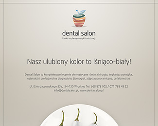
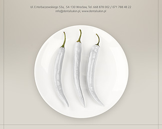
ReplyThe stripes - You're right, I didn't look at it this way. Probably stripes look better in other parts of the visualization (are arranged in a %22U%22-smile).*Btw. the apple is coherent with the ad campaign which also uses food as a symbol %3B)*%22Our favourite color is white%22:*http://pragmahead.com/pragmahead/portfolio/dentalsalon.jpg**Thank you for your comments.
ReplyApples have been known to act like natural tooth-brushes due to their texture, and the acidic juices give teeth a pearl white cleansing over time. Also, symbolically, they are commonly associated when teething to remove baby teeth for the adult ones coming in. I think that's one classic approach and/or symbolic use of an apple for dentistry.
ReplyPlease login/signup to make a comment, registration is easy