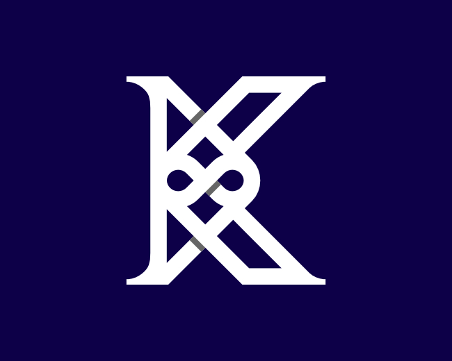
Letter K Infinity Logo
by proffartline • Uploaded: Jul. 14 '23

Description:
Initial K Logo. This brand looks Elegant and modern which is formed from the knot ties of thick white lines. In the middle, an infinity symbol is clearly visible as a differentiator, eye-catching as well as an iconic symbol for the identity of a company, business or community. Besides that, the trademark is so simple but still maintains a very masculine appearance classy and quality.
As seen on:
B U Y H E R E
Status:
For sale
Viewed:
175
Tags:
Monogram
•
Celtic-Knot
•
Infinity
•
K
Share:


Lets Discuss
Please login/signup to make a comment, registration is easy