Float
(Floaters:
2 )
Description:
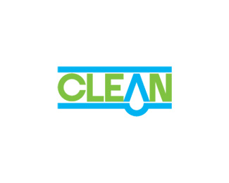
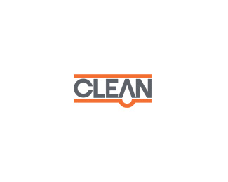
clean - another version. inpiration from sdijock
Status:
Nothing set
Viewed:
1399
Share:



Lets Discuss
like the color direction, better. At least that's my thought.
ReplyThanks for the mention and thanks for entertaining my recommendations. Looks great but you had a really solid logo to begin with! Nice work - hope you get a good price for it.
ReplyI would personally connect the %22A%22 to the bottom of the drop and put a touch of white space around the drop to bring it out from the bottom line.
ReplyPlease login/signup to make a comment, registration is easy