Description:
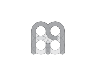
letters BMA combined into the two equal elements. The logo was made for a person who works in high tech industrial, but does not want that logo would be familiar to computers or something like that. Also it was needed that logo would not indicate the gender and would be strong and powerful.
Status:
Unused proposal
Viewed:
7666
Tags:
•
professional logo
•
logo
•
BM
Share:


Lets Discuss
Looks very nice, yet I wonder, is it only me that sees an elephant in that M letter?
Replyhaha nice. did not see that before ;)
ReplyI saw an elephant immediately! nice one though
ReplyPlease login/signup to make a comment, registration is easy