Description:
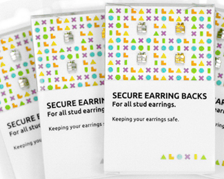
Aloxia is a new secure earring back product that aims to solve the problem of lost earrings through a unique gripping mechanism. The company approached me last year to establish a visual identity system that would resolve the practicality, utilitarian and accessible qualities of the brand and the fashion aspect of the accessory market.
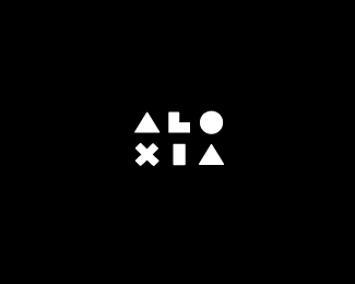
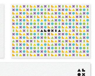
The elemental construction and rounded terminals of each character across the Aloxia logo-type was designed to fuse a utilitarian functionality with a friendlier and more accessible edge taking into consideration the predominantly female market. These letter-forms extend into a large and colourful geometric pattern and introduce a more fashion led aesthetic which also operates as a frame for the product.
As seen on:
BP&O
Status:
Client work
Viewed:
10357
Tags:
functional
•
practical
•
fashion
•
logo-type
Share:




Lets Discuss
Awesome branding mate.
ReplyThanks Guys.
ReplyAgree, this is a good style.
Replynicely minimalist!
ReplyReminds me of Mylo Xyloto.
ReplyVery good! Like the clearness and style. little bit playststionism but good anywere
ReplyABSOLUTELY LOVE THIS WHOLE DESGIN PACKAGE.*
ReplyPlease login/signup to make a comment, registration is easy