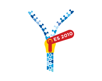
Description:
This comp. proposal was made for Spain's EU presidency in 2010. Spain will be president along with Belgium and Hungary until 2011. Each country would have the same logo, but the colors matching their countries flags. (zipper pull)
As seen on:
Status:
Unused proposal
Viewed:
3230
Share:



Lets Discuss
http://logopond.com/gallery/detail/43143
Reply%5ENonsense
Reply%5EI 2nd the proclamation of nonsense
ReplyAha... I see**Would you two, be so kind and declare your detailed opinion about the proclamation of nonsense? These kind of %22critiques%22 are just plain dumb, far from being professional. That simply puts down the judgement clear on the judge himself.**Actually it does make sense: A Zipper as a symbol of %22pulling%22 together the nations of EU, plus a zipper tooth looks just like a stylized human figure (head, shoulders). Any light in those dark caves? Guess not...if there's nothing to spark flames with...
ReplyHi Robin, firebrand and Lundeja missed your question in regards to what zip logo? so they see this as TC conrad saying this is a rip of my logo which was not his intention. They are saying that his link is nonsense not your logo. Make sense? TC should have explained this instead of just providing a link.
Replystarted with this comment to all that is confused. http://logopond.com/gallery/detail/50971
ReplySigh. Thanks for clearing that up logomotive %3B)
ReplyLogopond is like playing Old Maid somteimes.*BTW nice Concept Robin.
ReplyMy apologies...to Firebrand and Lundeja!**Thanks for clearing it Logomotive!***
ReplyHaha, it's ok. Nice work.
ReplyI love this very much
ReplyI find this concept nice but I'm afraid that many people will find this offensive, like that new euro-sculpture in Prag... Those people won't get it as the idea of unity and connection and they'll only see provocative subliminal message of zip hiding something behind (notch, notch)... Hope that you don't get me wrong here...
ReplyConsider turning the whole thing 90 deg clockwise. It looks a bit like a fly zipper at the moment.
ReplyType08: You are right, but that's why i choose to use the zipper only, without any %22garment%22 that would increase the feeling of %22something being hidden%22. I wanted it to be as %22transparent%22 as possible, that's why there's no start or end of the lines...**epsilon: tried it, it was the first version, but somehow it didn't seem right, it made the letters hard to read. And if I put the zip puller between the open lines, well errr.....it was kinda like a penetrating....you know what. Plus it blocks the view of the zip tooth. Maybe to tilt it 45 degrees would help...I'll try.
Replyi see the zip notches (teeth) as little blue people (head %26 torso) and if the zip is going up, then the people are coming together, but if the zip is going down, the people are being separated. cooool.
ReplyPlease login/signup to make a comment, registration is easy