Description:
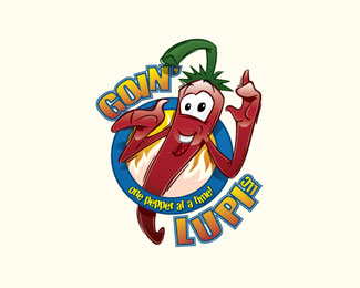
This logo was a redesign from a logo the client found wasn't working for them. The notion for the entire range, was to have a focus on some characters in the selling of the product. As 'jalapeño' was the most common and well-known chilli pepper, I worked on making this into a character. The result (if I say so myself) was very effective. Then the font and logo surround was manipulated to allow the balance of the company name and necessary information. This logo works best in colour, and a separate portfolio is available for this product alone.
As seen on:
Goin' Lupi
Status:
Client work
Viewed:
1920
Tags:
art
•
logo
•
design
•
website
Share:




Lets Discuss
Please login/signup to make a comment, registration is easy