Description:
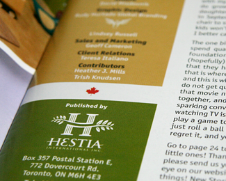
Publishing company, hestiainternational.com, by the way the owners are greek.
As seen on:
hestiainternational.com
Status:
Client work
Viewed:
13383
Share:
Lets Discuss
Now that's something.
Replyyes.. this is nice!... (only not liking the E)...
ReplyI agree, the 'E' is distracting. Otherwise very nice.
Replyand yes the e dosent look good
ReplyThe mark looks great and yes the e doesn’t look good
ReplyThe mark looks great and yes the e doesn't look good
Replysorry for that :) he he
ReplyThanks for the comment guys, I see what you are saying but the company is Greek and I couldn't help giving the greek E to the logo, they love it though.
ReplyI was going to say I kinda liked the greek look to this and recommend you don't change it.
Replynicee!!
Replygreat logo, i think the e works beautifully.
ReplyThank you thinkhammerhead, in general, people have responded well to this logo, it prints well too.
ReplyThank you for your comments Alan and Trish.
ReplyThanks Elena for your support :)
ReplyThank U very much Sean and Vlad.
Replyoh yeah I love this one!
ReplyI just came back from soccer and saw this, thank you very much Rich for your comment, we lost BTW : (
Replyvery nice mixture between the elements. great result
ReplyThank you for your kind words Alex.
ReplyThanks Saawan, nice showcase you have there.
ReplyMuch appreciated Snowkai, nice work you got there.
ReplyGreat outcome dude. I think it's perfect with the greek character, the leaves and the poles. It creates the synergy.
ReplyThanks Mads, really appreciate it. sorry for the late response.
ReplyYes, love it. The greek E adds flare.
ReplyThanks about the E Laura, the clients love it, I think its what's important...and that they pay :)
ReplyDon't know how I missed this one as it's very nice.
ReplySean, thanks brotha!
ReplyThank you very much Rick Landon.
Replyi dont kndw about Epsilon:) But the mark is great man!
Reply%A1y que te agregan a la galer%EDa!**%A1felicidades!, merecid%EDsimo, dir%EDa yo.
ReplyGracias tocayo, no sabia pero gracias a ti me di cuenta, saludos.
ReplyThank you very much Tolobek, really appreciate it.
ReplyThis is quite nice.
ReplyThank you JF.
Replysoo good
ReplyThanks again :)
Replyso elegant. love it :)
ReplyThank you again on this one xmadenyux.
ReplyDid this bad boy make it into LL Rudy? Always been a favorite of mine.
ReplyYou got it Joe, thanks for asking and I'm glad you appreciate it, one always questions if people will respond to our work and it's nice when they do.
ReplyI'm a huge fan of this one too, Rudy!
ReplyYou are so kind Sean, good man you are.
ReplyNice one my man!
ReplyThank you Michael Spitz. saw your logo in Logo of the Day site, sweet!
Replyvery greek %26 also very publishing, Rudy!
Replyreally nice project! (:) just don't know about the %22E%22)
ReplyThank you guys for your comments, well, this logo still going strong :)
Replymissed so much of your brilliant logo work ... this is great !
ReplyLike it
ReplyThanks so much Bernd, I missed your comment on this one :)
ReplyThanks again elhosary!
Please login/signup to make a comment, registration is easy