Description:
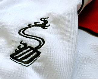
The "S" for Spatulas' symbol goes on front of the Jerseys.
http://logopond.com/gallery/detail/65154
Status:
Client work
Viewed:
3536
Share:


Lets Discuss
Awesome :D
ReplyGOOD
ReplyCool - I'd get one of those T's : )
ReplyThank you C7, those would be our uniforms to play, and I'll tell you the name could be cheese but our look ROCKS! Now, if we could win more often.
ReplyThe depth would be reinforced if the handle thickened as it approaches the foreground.
ReplyThanks for your words logoboom, i really didn't go for depth in this case, I see what you are saying but I wanted to keep the same thickness in the spatula throughout.
ReplyThanks for your float Igor.
ReplyThank you Phil.
ReplyThank you Rich.
ReplyThank you Andreiu and Petar, Andreiu great work man!
ReplyThats a great take on a spatula!!
ReplyThank you Carlos for your words on the %22S...patula%22 :)
ReplyI love it. Very dynamic, while still being simple.
ReplyThanks Ryan, glad you appreciate it.
ReplyThanks Ryan, I'm glad you appreciate it.
Replyawesome rudy!
ReplyThanks Niall, showing your big heart.
Replywho ever thought a spatula could be so cool, leave it to Rudy to do so
ReplyHa, ha, ha Raja, I asked the same question to the team, thanks my friend.
ReplyHot)
ReplyThank you so much Alexandre.
ReplyPlease login/signup to make a comment, registration is easy