
Description:
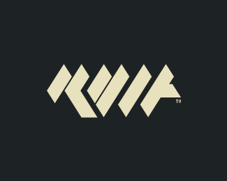
Logo developed for a friend's personal website, the result can be read in diferent ways, like double "M" or "WWW" and the symbol creates in the center the less than "" used to open and close tags in html a small detail regarding the webdevelopement, used a pixel font to complete the final brand. This is just a adaptation to show here, see the original in the website.
As seen on:
marcomonteiro.net
Status:
Client work
Viewed:
2069
Share:





Lets Discuss
Nice implementation and meaning of symbols for the mark. Sweet.
ReplyThanks JoePrince, this was developed specifically for the website, although the logo can be printed too, the font maintains the %22pixel%22 aspect.
ReplyPlease login/signup to make a comment, registration is easy