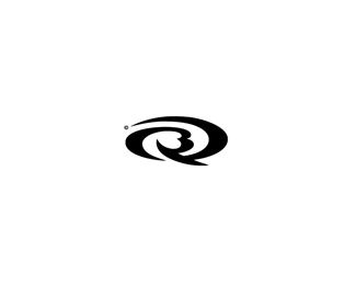
Description:
QB Monogram proposal for a local surfboard shaper. UPDATED - based on the feedback now in black and white (with no type for now).
Status:
Nothing set
Viewed:
6394
Share:


Lets Discuss
I like where this is heading, but i feel like it wiped out before getting there.*I definitely see the Q/B so kudos on that, but the gradients arent meshing well enough for me.**Also you need to spend a bit more time customizing a font for this. Its feeling like html/tech font right now.**
ReplyI like where this is heading, but i feel like it wiped out before getting there.*I definitely see the Q/B so kudos on that, but the gradients arent meshing well enough for me.**Also you need to spend a bit more time customizing a font for this. Its feeling like html/tech font right now.**Of course i realize this is the presentation stage, my commentary is hopefully constructive.**
ReplyHi Greg.. I'm not sure I understand what you mean by the gradients aren't %22meshing%22? Perhaps you could elaborate? I would probably have avoided using a gradient altogether but felt in this case it helped reveal the subliminal representation of a surfer in the tube.*The vast majority will probably never notice but, I tried to develop the monogram so the Q formed a wave and a surfboard with the bumps of the B alluding to the head and body of a surfer. (If its adopted) the mark will probably appear solid black in most applications (surfboard decals etc) and you can still see the surfer on the solid version once you know its there. There will be some who say if Joe Average doesn't %22get it%22 right away logo%3Dfail, but surfers are a unique market who know (and almost celebrate the fact that) Joe Average doesn't %22get%22 alot of things. Hopefully the QB is obvious and unique enough to be memorable in and of itself and anyone who manages to see past the letters will feel all warm and fuzzy that they are clever.*Font-wise - While I am not totally convinced about what I have either, if you look at what is happening in the industry there seem to be three main approaches.. the soul surfer freehand script style, the grungey/grafitti counter culture style, and the we're serious about performance tech style. Existing branding for QB fell into the latter category and complemented the QB mark far better - hence my selection.*Thanks for taking the time to comment on my work - I am keen to get some feedback from any surfers on the pond.. there must be a few out there??
ReplyAverage Joe doesn't always have to 'get it'. Nice if they do, but as long as the logo works with the industry and market, you are golden in my opinion. For those who do see it now and later on when it dawns on them, that is just icing on the cake. No if your logo depended upon the Average Joe 'getting it', then it would fail if they don't.**I floated this because of your explanation. Sweet idea!
ReplyI think this is great. The only thing I would change is to make the two shapes one so that the blend is continuous. I do not like the break between the Q and its leg. Very nice and appropriate mark.
ReplyCheers guys :) *Glen, I hear what you are saying about the gradient - while its perhaps not the most aesthetically appealing rendering solution I intentionally disrupted the Q and its leg to try and highlight the hidden surfer and give it a touch of depth.. *Perhaps the gradient is not even necessary? The solid version (which will be used for the majority of applications) looks fine I guess it's just difficult to see the surfer unless you know its there..
ReplyUpdated.. lost the gradient.. and the type. This will be how the mark would appear on boards/stickers and the vast majority of applications.
Replylooks great dude, just reminds me of the good humor logo a bit!
ReplyGreat monogram!!
Replya very nice flow on this. top work. some very tasty stuff in that showcase of yours.
ReplyTotally radical. Definitely appropriate for the surf culture.
ReplyPlease login/signup to make a comment, registration is easy