Description:
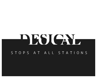
An entry for icograda design week held at IDC, Mumbai in February 2007. The topic was: Design Local - Stops at All Stations
Status:
Nothing set
Viewed:
2880
Share:


Lets Discuss
readability seems to be the issue here, even though: who needs to 'read' a logo? Personally I like it, but I'd consider adding plain text just to make sure everyone gets the name...
ReplyI intuited Local right away without actually seeing it. It looked like design should be there, but I couldn't see it at all until I confirmed it by looking at the title. I think it is the loss of the G in Design that does it for me. If you extend the center line of the A to the left a little, maybe then the G would be seen. Design just doesn't read without the G.
Replyjust great, even if the readability is not really easy I love it!!
Replyclever
ReplyYou made me go through all the effort of logging in just to tell you how Brilliant this concept is.
ReplyThank you, Raja!*Though It still need a lot of work.*
Replyyeah good concept. the secret will be finding the right counter.
Replyreminds me of this :) http://logopond.com/gallery/detail/18593
ReplyThank you guys, I'll definitely work on it.
ReplyBrilliant. **I read it fine straight off, I just then couldn't be certain I had read it correctly until I read the title. **Quite brilliant.
ReplyThanks again!
ReplyJus brilliant, i read wat needs to be read, may be a sans serif would make it a lot more clear and clean IMO
ReplyPlease login/signup to make a comment, registration is easy