Float
(Floaters:
39 )
Description:
concept ...
updated now.
Status:
Just for fun
Viewed:
7509
Share:


Lets Discuss
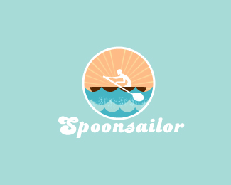
i like this ... maybe human figure needs to be little more visible
Replyhey subarh..nice illy bro...**maybe the spacing between the mark and the type is a lil off...could be composed better...the boat looks flat...maybe the edges of the boat need to be curved rather then straight...aslo do somthin about the head of the sailor..it looks like a martian...make it more human...and u might have a winner..:) al da best.
ReplyThanks Shylesh and Nitish... *improving it. will update soon:)
ReplyI am liking it.
Replythanks milou:)
Replywhy kill it with the wgite stroke and dropshadow? :( i love it otherwise.
Reply_white, sorry
Replywhy kill it with the white stroke and dropshadow ? :( i love it, otherwise.
Replyhey lecart... i hav other version too with white outline out... just deleted today night.
ReplyThanks For ur flosts n comment guys....*thanks David for gallery spot.
ReplyToo coool!
ReplyNice! Love that type :)
Replynice tipography!
Reply%5E%5E%5EThanks Guys:)
ReplyI like the mark, but isn't he rowing?
Replycool mark, typography is great too, gratz
ReplyGreat use of color and the illustration is seriously clean and nice. I love this a lot!
Reply@ jeremydouglas- Thank, yup u can say that but i want to show here a small boat in sea, to exaggerate the feel of amaze. u can see he is rowing in high waves:)**%5E%5E%5E%5E Thanks guys for comments n floats here
Replynice one bro....
Replythanks pal...
ReplyVery nice!
ReplyPlease login/signup to make a comment, registration is easy