Description:
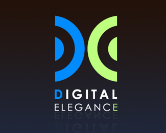
Digital Elegance is an IT installation company for home theater and touchscreen systems. So I sort of combined speaker-like hardware with the letters "D" and "E" to form this imagery
Status:
Client work
Viewed:
1305
Share:


Lets Discuss
Skip the reflection, work on type and it's there. Really strong concept.
Replyya... i too agree with alexander, dat is really a must do change and iam also thinking about text, just D %26 E are colorized....though it is looking good, i think it is making a small damage to the overall balance of the logo unit
ReplyThanks for the feedback. I made the changes: http://logopond.com/gallery/detail/106339
ReplyPlease login/signup to make a comment, registration is easy