NYRA (New York Rowing Association) Golf Tournament

Description:
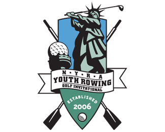
Logo created for a charity golf outing sponsored by the NY Rowing Association. Unfortunately, the outing actually never took place due to lack of sponsorship, even though all the print and embroidery materials had already been produced. What a waste.
Status:
Client work
Viewed:
8719
Tags:
sports
•
sports
Share:


Lets Discuss
briliant work sdijock... love it
ReplyThank you nido. Your feedback is much appreciated.
ReplyReally cool logo! Excellent.
ReplyThanks OMNI. I checked out your site - you have a really nice clean, elegant and simple style to your work - great stuff.
ReplyThere are so many elements in this that it works really well for the purpose! I like it! Nice job.
ReplyThanks for the feedback everyone.
Replyniceee!.. i think the color should be a bit brighter.. but this one is creative!!
ReplyThanks for the comment bogglins. The colors were actually chosen on the muted side purposly. The colors were meant to convey sky (blue) and grass (green), and I didn't want them to be too vibrant because the logo would come off as looking garish and juvinile. The golf event was meant to attract corporations and wealthy contributors, so it needed to be somewhat upscale and more vibrant colors wouldn't have worked.
ReplySolid logo.
ReplyI appreciate the comment grub.
Replynice logo, very fun.
ReplyVERY NICE!! I think this logo has class but then again its funny. Good Job!
ReplyThanks Antonio. That's pretty much what I was going for when I designed the logo. I'm glad you picked up on it.
Replylol this is awesome!
Replyreally fun logo sdijock, well done!
ReplyThanks for the compliments designabot and gyui. Much appreciated.
ReplyThis is great. The only thing i maybe would change: the colors. The perspective with the ball is amazing!
Reply@thewebster - Thank you. Much appreciated.
Replyhahaha! great idea!
ReplyThanks again andreiu.
Replygood stuff man.
ReplyThanks Lecart.
Replygreat piece
ReplyMuch appreciated Bernd. Thanks for checking in.
ReplyIllustration is just spot on with the event's intricate name. Great job!
ReplyGreat illustration work, but a bit to much details
ReplyThanks guys! Appreciate you taking a look.
Replyvery good work a great idea%0D*axyen4ik)
ReplyAmazing and not another word.
ReplyThanks guys! It was a fun project. Too bad it never went anywhere.
Replythat must have been one hell of a brief
ReplyLOL @ Raja! No real brief to speak of for this client. Basically they let me do whatever I wanted as long as the logo incorporated rowing, golf, and New York. Although, I did show them a pencil sketch before I went to the computer, so at least they had an idea of what they were getting.
Replyabout time I saw this logo in the gallery!! A spot well deserved!
ReplyThanks Antonio.
ReplyHahaha! It's great!!!
ReplyGlad you like it to-to.
ReplyIt seems to me that the ores look like shovels. Also, the line weights you used are a bit flat and some varying line weights could really help this concept come to life. Overall, little dry and could probably use some scroll lines as well.
Reply@brionisaacs - Thanks for your comments. If you take a look at competition sculling oars they do in fact look exactly like I've illustrated, with squared off heads. And the line weights within the Statue of Liberty illustration do vary, so I'm not exactly sure what you're referring to. I also think the concept of Liberty using her torch as a golf tee is anything but dry, as you can tell by some of the favorable remarks by other designers about this logo. Not sure how much more conceptual you can get for a golf tournament taking place in NY, but I'd love to hear your ideas of what you would consider a non dry concept. **You're definitely entitled to your opinion, although, this logo has been in the gallery - twice. Sorry you're so upset over my critique of your horse nail logo. Be well.
Replyi think this is great.
ReplyLove your work. How do I get in touch with you?
ReplyPlease login/signup to make a comment, registration is easy