Description:
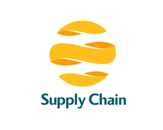
Brazil´s Pepsico Supply Chain logo
As seen on:
www.sebastiany.com.br
Status:
Client work
Viewed:
16100
Share:
Lets Discuss
this is nice, but sort of reminds me of the suzu logo i think? **i also would work on the type a little bit, doesnt seem to fit the mark**cheers!*sean
ReplyIt reminded me more of sidewinder, maybe its the colour
ReplyI don't know how this logo relate to a mall logo in my town, but please check this out http://www.pacificplace.co.id/upublic/ and tell me what you think, thanks.
ReplyWe were lucky that at least the mall logo was not a sphere... The concep that we used here is not new. Logomotive and others has used the same concept too... But a total coincidence with the mall logo or any onther would be a disaster... thank you Samuel for pointing that out!
ReplyYeah, I kinda shocked when I saw your logo at first, because the mall is one of the finest in Jakarta. And this piece is quite similar on the cutting part.
ReplyPlease login/signup to make a comment, registration is easy