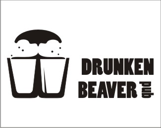
Description:
still have issues with the nose. either it is too much foam and too little nose, or backwards...
Status:
Just for fun
Viewed:
3995
Share:



Lets Discuss
Freaking cool idea. Execution is looking good. Best of luck with that nose!
ReplyI think it looks great, I totally get it right away. Nice job
Replycheers guys
Replyi *love* the nose/pints. less taken w/ the type. i could see this as a carved wooden looking sign. maybe the type in a circle w/ a different font? just an idea.
Replythanks. i will definetly try the carved wood thing. i sort of like that font though, because it's not too serious. will tinker with the kerning and alignment as soon as i have some free time.
ReplyPlease login/signup to make a comment, registration is easy