Float
(Floaters:
45 )
Description:
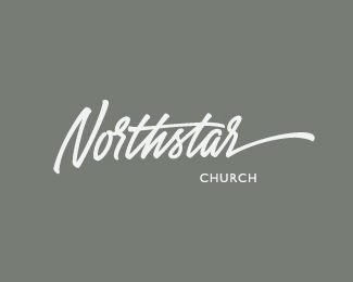
Logo for the Church from Florida, US
Status:
Client work
Viewed:
13171
Share:

Lets Discuss
another nice one
ReplyThis is excellent! Maybe a little too 'hillsong' but it could work. 'church' seems a bit small and tightly spaced for how far away from the script it is. Really nice lettering!
ReplyThis is nice! Its got a great a flow starting from 'o'. The last stroke on the 'N' maybe could go the same way as the rest? But overall this jumped out at me straight away. Very nice work and showcase too.
ReplyGreat script as usual, Serhos!
ReplyTop notch. Although %22church%22 feels a bit disconnected.
ReplyNice logo. Thumbs up :)
ReplyThank you guys for your words!
ReplyVery cool, what type of medium do you use for your script logos?
Reply@bad03xtreme: Thank you for your comment! What do you mean by %22Type of medium%22 here?
Replysupear neat type
ReplyDo you use a pencil, marker, or stylus to create the freehand type? Very curious about your process, love the outcomes.
ReplyJeff, I always start from paper sketches using different writing tools, then when I'm complitely satisfied with what I did I make a vector. You can find more about my process here: http://www.typedivision.com/process/type-division
ReplySimply beautiful typographic work!
ReplyJust curious what you might charge to design another church logo?
ReplyHey Josh, write me via email please if you want to discuss my rates and other details. Thanks.
ReplyYou've made it into the afterlife of your choice with this one. Exemplary work.
ReplyPlease login/signup to make a comment, registration is easy