Description:
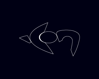
One for a 'monolithic'. 'landmark' building... overlooking the ocean. Also a bit of an experiment on how the sounds of words translate graphically. Does it work for everyone? Probably will end up as varying milled steel finishes. Can't seem to get the image very sharp here sorry.
Status:
Work in progress
Viewed:
908
Share:




Lets Discuss
I would never have read it as %22icon%22 had it not been for your logo title description. Sorry.
Replyno worries :) ... it is still a work n progress really and I guess a little 'cryptic' therefore, out of interest where do you think the difficulty in reading the word lies then?
ReplyHaHa.. ok I guess 'the jock' is off then, without having anything to say that can be used constructively :) ...anyone else having problems reading this? I have asked quite a few of my friends and they all say they can read it .. the 'I' is a little difficult and could be improved maybe, but that is it.
ReplyDude, what the hell is your issue? My comment wasn't a personal attack, I was simply stating the obvious. You indicated that you didn't want critiques but comments were fine. However, now that you've opened that door here it goes...The logo is illegible, it's as simple as that. The letter forms don't read as letter forms. It just looks like a bunch of jumbled shapes randomly thrown together and it doesn't matter that the final version will be milled steel. And I also don't see how this logo ties in to a %22landmark building overlooking the ocean%22. If that was a primary logo characteristic in the creative brief then you've failed at delivering on that.**Was that constructive enough for you? And next time you mock my name I won't be so polite (**insert smiley emoticon here**).
ReplyI Think you must be blind ... you clearly need to learn how to draw in both isometric and perspective and I will add that everyone I have shown this to can see the word sorry :) You can be as impolite as you want to be .. and quite frankly you are, You still don't quantify your remark in anyway you simply make continue to make statements... anyway I don't consider you comments as valuable in any way 'buddy'
Replyps.. perhaps you could explain your name... I just thought it was 'jock'? because that is the only combination of English letters that makes any sense to me %3B)
ReplyApparently I know more about perspective than you know about legibility. I don't see this logo making it into the gallery anytime soon. Maybe you can resubmit it when it's milled out of steel?
ReplyIt is very clear to me that you do not on both counts jock%3B just because you have a logo in the gallery it doesn't mean that is good, in fact technically it would fail any basic drawing class, also I did say that my logo was a work in progress, you suggested it was illegible and I simply queried it - which you ignored and then went off on some rude rant, since you wish to continue, I'll be the bigger man and suggest we clearly have a difference of opinion and leave it at that.
ReplyActually, the fact that it's in the gallery and has tons of floats from other design peers DOES mean that it's good. That's the whole purpose of the gallery and floats genius. Remind me, how many floats does your logo have? And my %22rant%22 was in response to you specifically ASKING for my feedback on your logo. You called me out publicly for not leaving a comment and then cried when I did. If you're going to be a little bitch when criticized then don't ask for criticism - it's pretty simple.
ReplyOk mate, I have a serious job and I my clients are amused at your comments, from the start your remarks have been rude, you are clearly unprofessional and your comments are out of order. If this continues I will have to take issue with you.
ReplyWhatever dude. I'm not the one with the illegible logo.
Replyart is what you see in it ... I see a shark from above !
ReplyCheers Tas! I agree with your comments on art... and yes it does look a bit like a shark. Anyway I have developed the logo some more and posting the update after this. Still a work in progress but I feel it is starting to take shape now.
ReplyPlease login/signup to make a comment, registration is easy