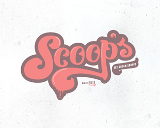
Description:
So here is something I wanted to do for fun and mess around with color and type etc. I have to say I was heavily influenced by Simon Walker. His work is amazing! Let me know what you think?
Status:
Just for fun
Viewed:
8391
Share:




Lets Discuss
This is really nice. I like it.
ReplyGreat one nicholas.
Replynice Type :o)
ReplyReally nice work!
ReplyWOW! Didn't think that would get featured! Thanks guys for being my biggest supporters! I really appreciate it! CHeers!
ReplyAfter seeing this i am really craving for icecream! :p
ReplyNice it reminds me a lil of luke lucas typography :D Lurve it
ReplyWell done nicholas, everything%B4s *lookin%B4good. I like the details *on the letters %22o%22 %26 %22p%22 on the *top, gives continuity with the *%22s%22 and the %22c%22, f l o a t e d !
Replysmooth, nick. :) and tasty.
Replylove colours, but all sign is great too
Replywow ...great one !
ReplyYeah, that is fine tuned type. Like.
ReplyThanks guys! I wish I could your guys comments! Much appericated about the kind words and feed back!
ReplyLookin' good, Nick. You definitely nailed the spirit of an ice cream shoppe.
Replyso luscious. mmmmm.
ReplyPlease login/signup to make a comment, registration is easy