Float
(Floaters:
4 )
Description:
Any feedback is welcome.
Status:
Unused proposal
Viewed:
1414
Share:


Lets Discuss
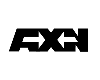
I like what you're going for with the negative space arrows (very fedex), but there are some things that are off I think.**The right side of the A and the left vertical of the N look too thick, are they?**I wonder what happens if you take the far right edge of the right arrow and bring it in line with the top slant of the N.**It needs some refining I think, keep playing with it.
ReplyA and N arent too thick i think, they have the same weight at both sides.
Replyi totally agree with CT7... btw, great concept. just need a little more work. :)
ReplyTo me, the negative space in the A makes me think it is an F or maybe an R
ReplyThe whole concept and the arrows specifically feel forced. I can probably live with odd and blocky shape of A, but the right arrow doesn't make any sense, especially its tail. It just looks slapped on top of the logo to counter-balance the left arrow.
ReplyI read Fixin
ReplyPlease login/signup to make a comment, registration is easy