Description:
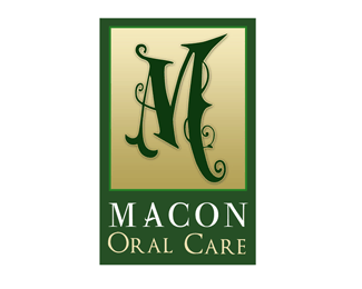
This is the logo that was chosen by the client. i have to fine tweek the type still but this is over all the one they picked.
Status:
Nothing set
Viewed:
3600
Share:
Lets Discuss
that's a pretty scary M for oral care. I think people are scared enough, they need the logo to put them at ease. YIKES.
Replyyeah.. i prefered the tooth logo i did. i made this as kind of a joke bc they wanted a big fancy %22M%22 %0D*%0D*but this is what they picked.
ReplyAgreed with KGB. It looks like the Addams Family version of a funeral dentist. Weird client.
Replythat looks more like Harry Potter's school for denstistry or somethingg
ReplyPlease login/signup to make a comment, registration is easy