Description:
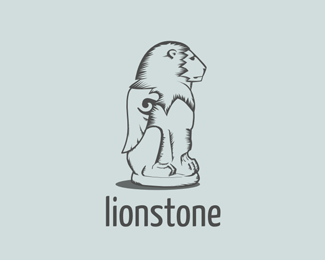
A lion statue for practice. Im totally new to this, so i'd appreciate any suggestions on how to improve it. I'm not happy with the head right now. The type isnt well thaught out either i guess.
Awsome site btw!
Status:
Work in progress
Viewed:
1683
Share:


Lets Discuss
very cute-friendly statue. love it!
Replysuggestion: maybe larger wings? they seem a bit smaller for that body.
ReplyNice line work... I would prefer to see the lion facing towards us though? Just a suggestion.
Replyhey, thanks guys. *ill try to make the wing larger.*@james... i guess that would require to make a completely new mark. I'll do that in one of my next practice runs.
ReplyI like it too. I quite like the wings the size they are. It is indeed a friendly looking illustration. Something bothers me about the font used for 'Lionstone' though? I doesn't seem to suite the illustration so well, I'd go for a more formal font.
ReplyPlease login/signup to make a comment, registration is easy