Description:
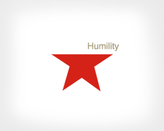
Humility, what the world is missing. James Strange, design, Illustration and art direction. Copyright James Strange
Status:
Nothing set
Viewed:
10795
Share:

Lets Discuss
Visually, this doesn't stand out from the crowd so much. But that's the point. Fantastic idea and the execution is spot on!
ReplyI've admired this one before. Very clever
ReplyVery clever indeed!
ReplySweet concept...but strange for non design headed entities :)
ReplyNoetic Brands, **Not sure what that means?
Replyfor all your detailed stuff... this is imo... your best work.
ReplyThanks Nido.
ReplyStrong message.
ReplyJust because of the Message a strong Logo...love it very much...both message und execution...
ReplyI think I get the head-pride connection. But to me the red is out of place, both in connection with the star and the overall theme/topic.
Replyseems strong, but i dont get it :S
Replysorry don't get this at all :( I'm there is a powerful meaning.
Reply%5E%5E No head?
Reply..and not a star.
ReplyThe star represents pride. Removing the head where pride lives represents humility.
Replythanks for the explanation.
Reply%5E%5E what about the Heart? LOL
Reply%5Eyeah thats the one that gets ya into trouble, in more ways than one.
ReplyHmmm!
ReplyGreat idea, nice concept! But the red... too military...
ReplyConcept is mindblowing. I was speechless when I saw it.
ReplyGot the concept right away James, no explanation necessary. Cheers.
ReplyThanks everyone for the very kind and inquisitive comments.
Reply%5E%5E dont worry about it tony i didn't get it either!
ReplyWell I actually got it in a different way. I looked at it as if the head wasn't missing, but it was bowed, bent down - which better conveys (at least to me) the message. However, great work.
Reply%5E%5E That is how i saw it too.
Replyhttp://www.slavimirstojanovic.com/016.html
ReplyLol I love it!
ReplyThanks icey011.
ReplyAmazing..!
ReplyPlease login/signup to make a comment, registration is easy