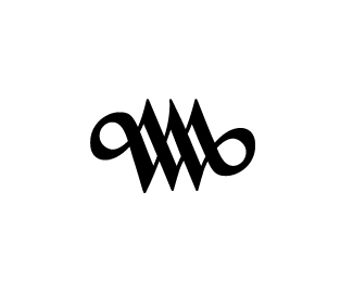
Description:
Id for industrial designer Willem Moorman
Status:
Client work
Viewed:
2818
Tags:
WM
Share:


Lets Discuss
I think it could be balanced a little bit more ... a clean simple sign takes its beauty out of its balance
Reply%5E I agree, needs to be more symmetrical.
Replythat's the word I was looking for ... %3BD!
ReplyPlease login/signup to make a comment, registration is easy