Float
(Floaters:
42 )
Description:
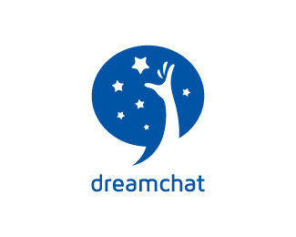
Logo idea for a chatting forum.
Status:
Just for fun
Viewed:
22621
Share:


Lets Discuss
Yes! very good. but it's not seems a hand at first
ReplyI disagree. I very easily see an arm/hand reaching for the stars, as well as a talk bubble. I think this is actually pretty cool.
ReplyThis is really smart, I'm not sure the bubble needs to terminate in such a shape point, it might be worth echoing the ends of the stars.
ReplyThanks guys... Actually I made the arm reaching in such way is to suggest that it is coming from outside of the speech bubble.
ReplyMake that yellow not yellow and it will be more cooler %3B-)
ReplyWhat about now? white.. looks prominent right?
Replylogo from the dreams:)nice!:)
ReplyThat's it, Antonius! It looks great on white bg :-) I really like the way you have incorporated hand in negative space to that speech bubble. Solid work.
ReplyYou got yourself a gallery winner here my friend :). Got my vote
ReplyHmmm...looks much better now. I didn't realize before how distracting the yellow was, but now with it gone, I'm REALLY feeling this one. Nice work!
ReplyThis is super!
ReplyThanks for the float guys, really appreciate it after some time off from logopond due to crazy workload.
ReplyPlease login/signup to make a comment, registration is easy