Description:
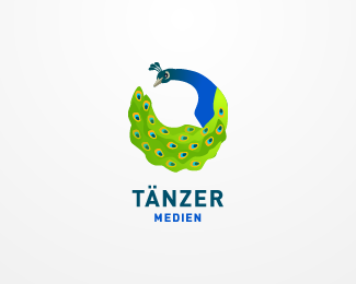
WIP. This is for a webdesign agency named "dancer" which does not want to look like a dance school. The mark shows a peacock forming a circle - representing a dance - and a speech bubble in the whitespace which of course stands for communications.
Status:
Unused proposal
Viewed:
19594
Share:


Lets Discuss
it't too complicated right now. I'm still working on the reduced version
Replylike both concepts nice work on these.
Replyi like the idea, i feel u are getting close to something really cool, keep it up
Replyhey, why is this on the frontpage?%5E%5E This is more like a sketch than a final logo... %3B)
ReplyI like it swiss... :)
Reply%5E%5E you need to talk with David then, about how he dared to make yr work featured %3B) nice once btw.
ReplyI'm the one he's creating the logos for. I absolutely love his idea using a peacock. Looking forward to the next sketches.
Replynice work, man, very pretty
ReplyI think that you need to add more colors in the peacock's tail. At overall the logo is very nice.
ReplyLooking closer at the design I can see you have put a lot of work into this. I am sure Taenzer will be very happy with the final logo.
Replyexcellent work
Replylove the illustration! love peacocks hahaha. the speach bubble is awesome... nice!
Replynice!
ReplyPlease login/signup to make a comment, registration is easy