Float
(Floaters:
17 )
Description:
Just something I'm working on.
Status:
Work in progress
Viewed:
4922
Share:


Lets Discuss
I like
ReplyThank you, I appreciate it.
Replysome pretty sleek looking type work, Tabitha.
ReplyAbsolutely love this.
ReplyThanks guys! :)
ReplyThis is really nice.
Replyjust about perfect good work Tabitha!
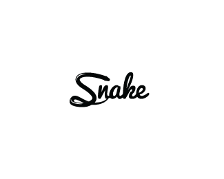
ReplyI think if you raise the top part of the 'S' abit more it would make the snake look as if its about to pounce on the other letters. Just making it visually more dramatic but ignore my rambling if it goes against the brief. Beautiful type work on the 'nake'!
ReplyThanks again everyone :) *@chanpion: Thanks for the advice :D
Replyagree with Chan, also it can be a bit more curved too, nice work
ReplyThanks dotflo :)
Replylike it may i have your id ????
ReplyThanks but I'm not sure I know what you mean.
Replythat's a pretty sweet looking type for monochrome.
ReplyThank you nydesign! :D
ReplyThanks for the floats guys. :)
ReplyPlease login/signup to make a comment, registration is easy