Description:
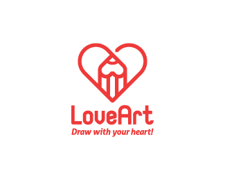
There are two hearts in the logo - the second one is the top part of the pencil (upside-down heart). The text was just slapped on, so please excuse the lack of aesthetic balance. :) ------- The word "draw" in the slogan , could be replaced with "write".
Status:
Just for fun
Viewed:
5455
Tags:
red
•
art
•
heart
•
pencil
Share:
Lets Discuss
Cool concept !
ReplyThanks, Michal!
ReplyOne of the best, if not THE best, heart concepts I've ever seen in my life. Symmetrical and natural, modern, nontrivial. Respect, Tanja!
ReplyWow Hrvoje, thank you so much! I'm really glad you like it!
ReplyExceptional work
ReplyThank you, Mario!
ReplyPlease login/signup to make a comment, registration is easy