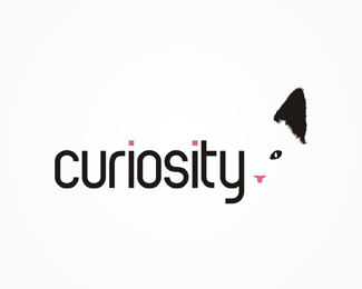
Description:
work in progress. any suggestion on how can i improve it?
As seen on:
www.alextass.com
Status:
Just for fun
Viewed:
2667
Tags:
custom
•
custom made
•
branding
•
identity
Share:


Lets Discuss
I like the idea. Maybe make the cat's eye %26 nose a bit bigger (more prominent). Right now the ear is very dominant and you don't catch the eye and nose right away. Simplify the shapes, so it's not too realistic. Just my thoughts.
Replythanks for the comment. the 'model' for this was my own cat, so i have respected her 'aspect ratio' and ear fur style :)
ReplyPlease login/signup to make a comment, registration is easy