Description:
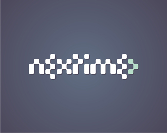
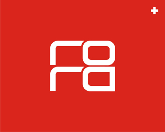
Logo for clubbing / electronic music portal. I have started this from the 3 dots arrow (from the right), pointing out the future, the 'next', and then build all the other letters based on that pattern. What do you think?
As seen on:
www.alextass.com
Status:
Client work
Viewed:
5497
Share:

Lets Discuss
For some reason, its easier for me to read reversed out this way. Fun concept.
ReplyThis is more readable than it should be. Good job.
ReplyInteresting i tend to have the same feeling, that reversed is much clear. More readable than it should be? :P Should i lower the readability? :) Thank you for your comments floats.
ReplyNo no, sorry that's not what I meant. I meant to say, it's more readable than I thought it would be (seeing as how it's basically a checkerboard). It was a compliment, but maybe didn't sound like one. Hope that makes sense.
ReplyThe good job part sounded like a clear compliment, but that %22it should be%22 made me think that it was too much. Happy to hear that it's a good thing too. Thanks for the explanation. :) Good comparison with a checkerboard didn't think about that.
ReplyUuuu, this baby made it to the gallery! Awesome, thank you!
ReplyGreat job! When I saw the thumbnail at first I also didn't expect to be able to read the name - but it popped right out at me!
ReplyRemoved from the gallery? :(
ReplyPlease login/signup to make a comment, registration is easy