Description:
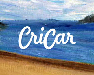
Logo design for www.cricar.com, the artworks / paintings portfolio of a friend, Carmen Cristea. She developed in the past years a profound interest in sketching and especially oil painting and this website gathers her works and evolution.
As seen on:
www.alextass.com
Status:
Client work
Viewed:
2022
Tags:
logo
•
logo design
•
design
•
word mark
Share:


Lets Discuss
pleasant!
ReplyThank you Alena!
ReplySince you're seeking critique as I am, let me say that the I am not big on this trend of white/black script on a blurred/solid background. I think it reached the point of saturation if not exceeded it and lost its previous luster and appeal.
ReplyYou can critique my artworks the way you like :)
I am sorry SuperEagle, I am not sure what trend are you talking about. The background is one of her paintings with no blur or special treatment while for the logo I have chosen white because on this painting a white or black signature would be proper (on the canvas she used black, I have chosen to use white here for better visibility).
ReplyTalking about critique your comment talked about a trend, not about my work done on this logo.
Please login/signup to make a comment, registration is easy