Description:
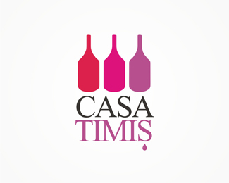
Romanian wine seller. Proposal in a contest, was one of the client 2 final options, but he went with another proposal. It figures a bottle-glass positive-negative space game. The drop is a Romanian specific typing character (a diacritical mark).
As seen on:
www.alextass.com
Status:
Unused proposal
Viewed:
8365
Tags:
custom
•
custom made
•
branding
•
identity
Share:



Lets Discuss
Very clever
ReplyVery well done.
ReplyYep, looks really good. Like the colors too.
Replythank you for the comments!
ReplyNice positive and negative.*The way it bounces back and forth is easily done.
Replythank you all for compliments.
Replythis is much better than the other. well done. haven't seen it done like this yet. clever.
ReplyI'm sure someone else will mention it but did not someone like raja do this earlier.?
ReplyWell, unfortunately at the time this was made (october 2007) i was not aware about raja, or pond. later (not sure at what point) i've find out about both. I know his similar logo too, to be sincere make me sad when first saw it as it had quite the same idea that was making me not the only one who did that. I can bring out some schetces on how did i got o this shapes but i am sure it's just a question of trust, and everyone will be subjective inn believing or not. Respect on raja's work and thank your for the comment logomotive i was not remembering in which portfolio did i see the similar logo.
ReplyWe all sometimes find out that our great idea was/will be done similar way but your execution is just 100%25. You have my vote!:)*
Replygreat work of negative space
ReplyLove the positive/negative.
ReplyHello :-) dropping by to congratulate you on some good work. You've got some nice things around here. This one is my fave.
ReplyThanx guys!
ReplyI just love this one.
Reply:) Thank you!
ReplyI made an almost similar design with 2 bottles and 1 glass though. And it was in 2007 as well. I did not know about LP back then either.
ReplyIts very nice BTW!
ReplyThank you. Well in time i've seen about 7-10 logos designed on this idea. The first one was the most difficult to admit and accept, the rest of them came a little easier. It seems that many designers imagined this. Some even better than i did i have to admit. **To be honest when i've designed it i was very happy with it, but now after a few years i find that type solution a little to very uninspired. :)
ReplyOriginal and elegant, interesting option!
ReplyThank you! :) Unfortunately on the original part, i have seen during year similar concepts, one at least done before, and even thou i was very proud if my idea i felt very bad about seeing it, sometimes even better done by other designers too. :) I guess that this is life, full of surprises.
ReplyPlease login/signup to make a comment, registration is easy