Description:
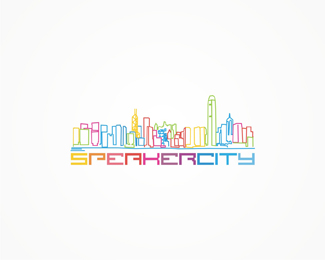
Speakercity party organizer from Hong Kong (the lines describe the Hong Kong skyline). 2007
As seen on:
www.alextass.com
Status:
Client work
Viewed:
4233
Tags:
custom
•
custom made
•
branding
•
identity
Share:

Lets Discuss
Looks quite nice although graphic itself is a bit busy. Have u tried to have name in black or gray or something? Not sure that u need to have everything in those colors. It should pop out more with black/gray txt.
ReplyI'm guessing because it's a 'party organizer' there are lots of colors. I like this%3B it is a little busy for color, agreed with Wizemark...but it works, in my opinion.
ReplyOh just that i forgot to mention that i used the lines to describe the Hong Kong skyline.
ReplyPlease login/signup to make a comment, registration is easy