Description:
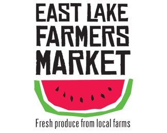
Where neighbors go for fresh fruits and veggies on Saturday mornings in this Deep South town. Inspired by those homemade fruit stand signs on any country road.
Status:
Nothing set
Viewed:
1528
Share:
Lets Discuss
I think %22East Lake Farmers Market%22 says the same thing as the tagline. ditch the tag. You might think of another mark that shows more than watermelon. I also think it should be FARMERS'
ReplyThank you for the comments! It really helps to have any outside input since I work alone. I should have loaded it w/o the tag. I wondered about adding more fruits or veg, but thought it might look too cluttered. I wanted it as simple and bold as possible because it has to show up well on banners. There is a horizontal version too. Do you think customers might think all they sell is melon?
ReplyMost farmers' market identity get too cluttered in trying to represent EVERYTHING sold at the event. The simplicity of this design is really refreshing. The type treatment and illustration are great!
ReplyI like this. It has the rough hand drawn look to it that you see at most Farmer's Markets, they never really tend to invest in a professional sign painter. LOL. Nice work.
ReplyJeff and admarcbart... thanks for the kudos! It's exciting to get approval from pros with great portfolios like yours. But I know I've got a lot to learn from you guys. I'm open to all critiques because I really want to improve, even though I've been out of school for ages.
ReplyPlease login/signup to make a comment, registration is easy