Description:
personal creation, updated after taking suggestions under consideration.
As seen on:
Status:
Just for fun
Viewed:
2488
Tags:
nature
•
turtle
•
wild
Share:

Lets Discuss
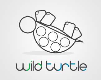
the turtle overpowers the type, there needs to be more balance between word/mark.
Replyi agree.. also.. i would say that this one would lend itself well to a well illustrated mark.. can you illustrate?... check out some of logomotives work to see what kind of thing im refering too... now i know not everyone can illustrate like he does... but i think the mark here should be given special treatment... %26 i think the font should be kept simple!
ReplyI kind of like the line illustration, although i think it does need a bit of tweaking, maybe simplify the lines even more, take out the 2nd line on the belly, the legs are very cool (I like the 2 different line weights) and maybe the head needs some shape. **I definitely agree that the type needs to be simple.
ReplyThanks for the comments, will definitely take into consideration. Especially with the turtle overpowering the text. Cheers
ReplyPlease login/signup to make a comment, registration is easy