Description:
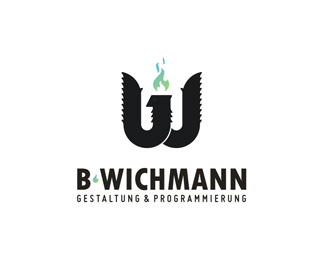
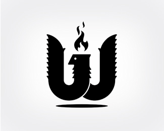
Here is the latest version of my own logo. The mark shows a bird that forms the character W. The bird represents my freelancing - free like a bird ;) You could also see the first two characters of my first name b and j. The flame represents creative power.
You could take a look at the process in my gallery. I tried to come up with a strong and clean mark and i hope ... i did it :)
What do you guys think? Feedback would be great!
Status:
Nothing set
Viewed:
1266
Share:
Lets Discuss
As you can see the bird has no eye. I thought the marks looks way more stronger and it supports the readabilty.*Am i right?
Replythe eye could be a lil more evil...i would love to c conventional flame (red and orange) IMO...g8 going bro..all da best.
ReplyPlease login/signup to make a comment, registration is easy