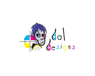
Float
(Floaters:
2 )
Description:
Logo I made for myself dal designs
Status:
Nothing set
Viewed:
1040
Share:



Lets Discuss
This was one thing that was brought up to me when designing my company logo.. Why CMYK?? You aren't a printer, you are a designer.. and chances are you are designing for more than just CMYK. I think that logo would not loose anything had you used other more naturally matching colors.
ReplyMaybe Conor is a print designer? %0D*%0D*This is strangely interesting %26 very memorable. I would suggest losing the effect on the type %26 go for a cleaner font. In black. Tis nice though.
Replythanks, i made a few more characters Im might incorporate them into my website let me hear your thoughts there on dframes.co.uk temporally.
ReplyI must say that overall this looks quite a bit off-putting. It reminds me of shrunken voodoo heads or something along %22these lines%22:http://store.prettygreatfun.com/images/categories/Shrunken_Head_Large3.jpg
Replyumm ok, the intent is a fun cheeky look but ok
ReplyPlease login/signup to make a comment, registration is easy