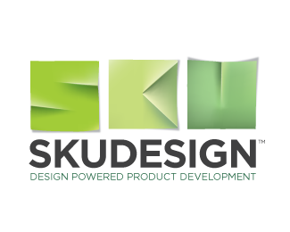
Description:
I'm wondering if I've gone too far with the letters. I like the idea a lot, but is it readable?
It's a logo for an industrial design consultant.
Status:
Work in progress
Viewed:
2239
Share:
Lets Discuss
Great 3D effect. How it works with solid colors?
ReplyThanks. At the request of the client, we're doing something I would never normally do -- there is no solid colour version. The logo only works in full colour, but the client is only planning on using it on business cards and a website. I'm not very comfortable with this, but I'm curious to see if, in 2011, it can happen.
ReplyPlease login/signup to make a comment, registration is easy