Float
(Floaters:
51 )
Description:
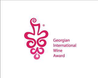
Logo for Georgian International Wine Award
Status:
Unused proposal
Viewed:
9623
Share:



Lets Discuss
The symbol is very clever in my opinion. Also i think that the type can be still improved (enlarge a bit, reduce the line spacing).
Replythnx tass. I'll tried too many versions of type but anyway maybe you'r right
Replygreat mark
ReplyI really like this and I don't mind the scale. Feels %22awardish%22. But you've got a color variance on that bottom shape that seems odd.
ReplyAgree with Glen. Also, very cool that you managed to incorporate all the letters into the symbol. Kudos!
Replythnx guys)
ReplyMe encanta, i love it!
ReplyI still reeeeeeeeeally want to see that bottom color made consistent.
Replynice work!
Replynice markey.
Replyvery well thought out, and the line quality you created has a terrific flow to it, I wanted to reaffirm what logoboom said, your line quality creates enough interest to remove the color fade in each of the sections.
ReplyVery pretty, nicely done champ:)
ReplyGeez, I feel so stupid! I just can't see the letters. I do see some kind of W down there, but anyway I'm not even sure. Please don't misunderstand, I really like this logo. It's just that I don't want to be like the plebeians who claimed to see the king's new dress. (If you know what I mean.)
ReplyGuys who are interested about the colors, right down your e-mails and I'll sand to you the vector fail of this work and maybe you'll have a fun around it) not joking) It's really interesting to know your opinions. thnx to everyone
Replygoog simbol, just the type needs work, congrt
ReplyHey William, let me see if I can make it more clear for you. :-) Do you see the W shape? Right above that to the right is the G then directly next to the G is a lowercase A. The I is created by the stem of the grapes at the very top. I see the swirl on top of the stem as the dot on the I. That's how I see it. Hope this helps.
Replythnx for comments to all
ReplyLove this, a very elegant feel to it.
Replyva es ar mqonda nanaxi, dzaan magaria.*GREAT!!!
ReplyPretty Cool!
ReplyLooking in internet i saw this logo in other page, http : // brandcrowd. com/logos/tags/grape
Replyand now, who is the original?
Looking in internet i saw this logo in other page, http://brandcrowd.com/logos/tags/grape
Replyand now, who is the original?
Please login/signup to make a comment, registration is easy