Description:
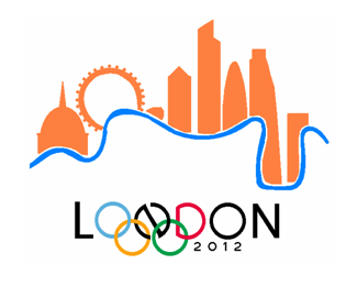
Considering the universal objection to the new London 2012 logo I decided to do my own one
(@.@) The funny man is looking worried : P
Status:
Nothing set
Viewed:
2512
Share:


Lets Discuss
definitely a considerable improvement to the terrible blocky olympic logo! i got a brilliant email today. ill upload it!
Replyhttp://logopond.com/gallery/detail/11711
ReplyThe only problem that you would have (and BTW I love the logo!) is that the IOC won't allow the rings to be used with that modification.**
Replythat's too bad because I think the London part with the rings and date work really well. I'm not a fan of the city scape above.
ReplyPlease login/signup to make a comment, registration is easy