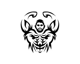
Description:
Logo design for a gym (Gym Rats United), U.S.A.
Gym Rats United is a clothing line geared towards the uncommonly driven, motivated, fitness loving individual. We provide excellent quality clothing that embodies the lifestyle of us iron addicts.
Status:
Client work
Viewed:
6239
Tags:
sport
•
clothing
•
fitness
•
face
Share:




Lets Discuss
I see rat! & see man
ReplyI knew it was yours, Peter ... always splendid work !!!!
Replyyeh but you got the concept from the tiger one....
ReplyThis is a meaner hairier rat look, thank you very much for your professional feedback Alena and Bernd! For me it matters a lot!
Reply'professional feedback Alena and Bernd'
ReplyExactly what in their comments was professional? Are you saying my comment is not professional?
You clearly did this after you saw the tiger http://logopond.com/gallery/detail/215026
Being that you are saying this is client work, I think my comment is the most professional on the page in that Im bringing your attention to the fact that its more than obvious where you got the concept from. You are a very talented designer no doubt, however this is rather blatant over inspiration, dont you think/
Dear David!
ReplyWell then, here is my client's e-mail feedback:
I made based on this my logo work!
I came across the logo you made below.
http://logopond.com/gallery/detail/176247
(Your Messiah logo has two major elements:
1) The face of a lion
2) The outline of a man (presumably Jesus Christ)
I want a logo of parallel style and elegance with two major elements:
1) The face of a MEAN RAT
2) The outline of a MUSCULAR MAN
In my mind, the greatest logos are communicate quickly and profoundly with a powerful minimal image like your Messiah logo.)
So please to take note of the above!
Thanks! Peter Vasvari
Does have a point here. ??
ReplyHmmm. I'm not sure what to think here.
Replyhttp://youtu.be/oww7oB9rjgw
Replyi hear you peter, maybe just odd coincidense
ReplyYes, and thank you very much for your feedback David, thanks ;-)
ReplyHonestly I see the similarity after the fact, but the whole execution is different. Compare the location of the eyes, the ears, and nose. Totally different. This execution is great and I don't think any person walking into the gym would confuse them at all. In fact, I wonder if many of the patrons would even see the rat here. In my mind there is no copying or conflict.
ReplyThank you my friend Luma, I really appreciate for your kind words ;-)
ReplyPlease login/signup to make a comment, registration is easy