Description:
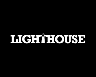
LIGHT HOUSE
Status:
Client work
Viewed:
9125
Tags:
space
•
negative
Share:



Lets Discuss
I like what you did with light (T). I bet if you spaced the letters more it would be an improvement. Also if you angled the serifs (pointy) it would naturally work in the H's. You could even add a base to T/Lighthouse. Just some suggestions. Nice idea.
ReplyDear logomotive! I say thank you for the vocational remark nicely! I employ it, I work on him longer...
ReplyHa no problem, leave this one though just in case I'm wrong %3B)
ReplyHaha %3B) Ok!
ReplyTo demonstrate what I'm conveying. See what I did with this slab serif. http://logopond.com/gallery/detail/73826 Look at the I's and E's and then your light angle. Hope that helps
ReplyI would not bother, but loving this concept :) would love to see it perfected.
ReplyThank you Very much for the vocational council! Sharp, good work!
ReplyPlease login/signup to make a comment, registration is easy