Description:
We are a London based startup called LONDONe
This is to be local site for Londoners to network, advertise,business directory and a classified board.
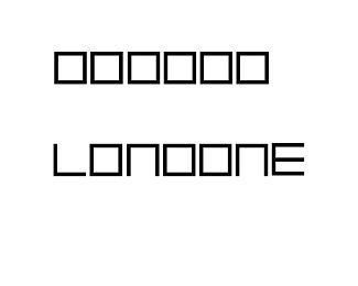
I have come up with the idea of making our logo with 6 equal squares and then removed 4 different sides from 3 of those squares.
2 sides ( top and right ) from the First square , 1 side ( bottom ) from the Third square and again 1 side ( bottom ) from the Sixth square. This formed the word LONDON and out of the 4 sides that are taken off I have formed the letter E.
I am looking for critiques on this and any further suggestions you may have to improve on this.
Many thanks
Status:
Unused proposal
Viewed:
533
Tags:
London
Share:
Lets Discuss
Please login/signup to make a comment, registration is easy