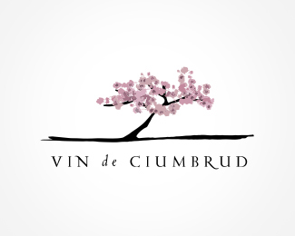
Description:
This identity is constructed on the fact that the vineyard is one of the few here in Romania that has a special climate that allows almond trees to grow, fact mentioned in almost materials. The logo is worked in detail, vectorial, and only uses three shades of pink, no gradients, so it looks good on any printing conditions.
Status:
Client work
Viewed:
5811
Share:



Lets Discuss
appreciable)
Replybeauty :)
Replyelegant off course :)*
Replyvictor ... what else could I say ... hanuman ... the fast and furious ... %3B
Replythanks for the comments! it's nice to be hear on logopond :)
Replythis has a great feel to it. nice job.
ReplyThe 'de' seems slightly off to me, but the mark is remarkable.
Replythank you very much! the %22de%22 has the role to make the more important words of the name have a bigger priority.. other wise I would have had to take more horizontal space with the type.
ReplyA tiny note on the %22de%22: I think it might look better if it was kerned closer together and italicized.
Replywowo:)
Replylove the feel of this, nice work, welcome to the pond*(ft fain portofoliul, felicitari)
Reply@ designtofeel - I did try it. it looked good. i liked this better (it still has a little angle), but that's a very good feedback. thanks!*..but I think your right with the kerning.. they should be a very tiny bit closer..*@ palattecorner - wohoo :)*@ dotflo - (multam frumos! felicitari si intr-o parte si alta :) )
ReplyPlease login/signup to make a comment, registration is easy