Description:
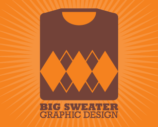
My personal logo.
My last name roughly translates from Italian as \"big sweater\", thus the business name.
I wanted something that looked classic and mature, being a young designer catering to a much older audience (thus the brown, slab serif, and simple shapes), as well as something that suggested an ability to follow trends (orange/argyle, the newness of a folded sweater on the shelf). I also wanted to convey the image of a folded sweater without really drawing one, and this came out.
Looking for any critique/suggestion anybody can give me. Thanks for viewing my first LogoPond upload!
Status:
Nothing set
Viewed:
10108
Share:

Lets Discuss
Great idea. I think the sweater could be made just a little bit smaller, but not by much. I think this will really appeal to your target audience
ReplyI think the mark is smart. I don't think the type should be any smaller or larger in relationship to thee Sweater. I think the type (size) treatment lends itself to being able to use the sweater mark sucessfully without the type , similar to the way Nike uses the Swish icon. When you see the Swish icon you know it's Nike, similarly, with repetitous use, your audiance/clients will know Big Sweater without using the typemark below the logomark.
ReplyPlease login/signup to make a comment, registration is easy