
Float
(Floaters:
0 )
Description:
Design + Marketing firm located in Las Vegas
Status:
Nothing set
Viewed:
1969
Share:





Lets Discuss
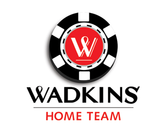
I'm drawn to this graphically, couldn't the double-u have the horns and eliminate the outside circle? and then the halo could sit in the negative space and then create a solution for the tail or just leave it out all together (isn't it usually a forked tail too?).**
Replyi agree with t conrad, an other option could be to fill the circle and have the W sit there in negative, and yes the triangle at the end of the tail is vital
ReplyVery similar to Maxim Magazine's logo:**http://www.counterfeitchic.com/Images/maxim%2520logo.gif
ReplyPlease login/signup to make a comment, registration is easy