Description:
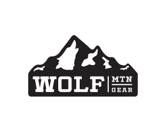
WIP. Rebrand for a mountain/outdoor survival gear distributor. Thanks for looking.
Status:
Work in progress
Viewed:
13886
Tags:
•
gear
•
survival
•
phil butler
Share:


Lets Discuss
I like this version man. Maybe just a tiny bit more thickness to those two lines in there to make it more applicable (I guess it will go on the gear to). The rest of it is spot on!
ReplyThanks for the help Alen. You're right, thickening the lines up worked nicely. Did you notice the wolf? Most people I've showed it to missed it.
ReplyI Did. I love the idea. Bet you could even get away with a bit more detail??
ReplyYup, the wolf is there, second white zone from the left. As Mike suggested, if you want it less subtle maybe you could work more on it, like the ear area for example. But I love it as is.
ReplyThat's pretty cool, but I didn't see it until Type08 pointed it out. Is it too subtle...not sure
ReplyI didn't see it either, but now that I do it's awesome. I think you could get rid of the other peaks and white areas and just have one mountain with the wolf head. Simplify.
ReplyI also saw the baby dinosaur to the far right. Genius.
Reply^ Oh ain't he a cute little bugger.
ReplyToblerone ;)
Reply^ I can see that similarity.
ReplyThanks for all the great feedback guys. Much appreciated. Also, thanks for the gallery add whoever was responsible for that. Still toying around with the wolf head based on your comments. Seems like the only people that notice the wolf are fellow designers and maybe 30% of regular people.
Reply@lumavine - good call on the single mountain approach. First designs were based on a single peak but the client insisted on the mountain range as it is a landmark in their neck of the woods.
@ nido - damn, it was supposed to be a gecko :)
@ Shrubowski - been designing for a long time and I never knew there was a bear hidden in there. Hey, learned something new today :)
Hmm.
Replyhttps://www.facebook.com/gearatwolfmtn/
Worth going after? Not sure.
ReplyI think he started w your logo then switched to the one in this video until he got in trouble. Now he is gone back to yours. See the comments. https://m.youtube.com/watch?v=yYEHOror36A
ReplyI am told there are also some comments on Backpacking Gear Reviews and FAQ Facebook group
ReplyThanks for the update/help walker1234. He's still using it on his facebook page. He removed the youtube video though.
Replylooks like he updated facebook an hour ago also, at least he recognized he was wrong.
ReplyWere you ever paid for the logo you created for him? Or did he violate your copyright as well? He has had several logos, and he used yours to replace the one I did for him, because he never paid me, and I reported it as a copyright violation to FB so he had to put something up there, while he got someone else to make one for him. BTW, he asked me to copy your logo, and I refused, telling him that was a copyright violation.
ReplyThanks Kathy for the head's up. This logo was designed for a completely different client and had nothing to do with your client. So he was definitely ripping me off. Sad to hear that you didn't get paid for your effort. Seems to be happening more and more these days. As for the name of his company, I believe my client has the rights to that name and spelling. They have been notified. Thanks again for refusing to copy my logo :)
ReplyPlease login/signup to make a comment, registration is easy